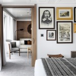
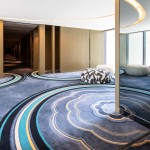
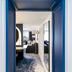
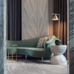
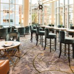
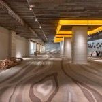
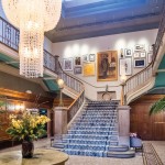
Have you ever wondered why you feel so calm when entering into a beautiful room with blue accents or so refreshed in a green bioliphic inspired room?
It’s likely to be because of colour psychology in interior design, closely connecting colour to our emotions.
Colour selection plays such an important role for our design teams at Ulster. Therefore we want to share with you some secrets to colour selection and the psychology between colour in interior design and wellbeing.
Did you know colour has the power to raise or lower our heartbeat, affect our sleep and even influence our overall wellbeing? An incredible amount of research has been undertaken into the psychology of colour and the impact it has on our health. Let’s face it our wellbeing is more important now than ever – in all areas and aspects of our lives.
“Rooms should not be put together for show, but to nourish one’s own wellbeing.”
Albert Hadley, Interior Designer
Writing on behalf of Hotel Designs, brand strategist Emma Potter says, “Hotel interior design is deeper than simply decorating, colour schemes have the ability to cleverly transform and/or evoke emotions and designing with purpose as a whole will result in space that is more functional, more inviting and more appropriate to the guests checking in.”
Colour psychology is used as a powerful interior design tool that arguably has more of an impact on the mood of a room than any other factor. Emma Potter explains “Interior designers and hoteliers put a huge amount of effort into the hues they choose to decorate a space, be that a lobby, restaurant, bedroom or lounge area, as they appreciate the effect colour has on their consumers’ emotions. In order to create an appropriate scene for a certain target audience, it’s worth understanding the science of colour psychology and the tremendous ability it has to change entire moods.”
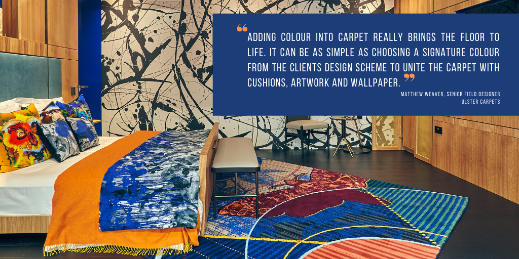
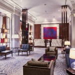
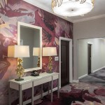
Colour selection is a critical part of the design process at Ulster Carpets; it helps create depth and breathe life into what has been imagined. With over 650 colours to choose from plus the ability to custom dye to find that elusive shade, Ulster’s creative team can help enhance an interiors designers scheme from the floor up.
Thanks to Ulster’s unique advanced weaving technology we have total design freedom allowing our designers to maximise their colour usage to suit every brief. Matthew Weaver, a Senior Field Designer at Ulster, says “Adding colour into carpet really brings the floor to life. It can be as simple as choosing a signature colour from the clients design scheme to unite the carpet with cushions, artwork and wallpaper. Whether it’s a calming soft blue tone in a spa area alongside neutrals or a bold infusion of orange and teal in a restaurant, colour adds value and completes the story.”
Mood boosting colours
Take a look at what Hotel Designs have put together:
Some may argue that using neutral colours (beige, cream, grey) will appeal to a broader market. While white may be a natural choice for a Greek Mediterranean style hotel, some people may associate white with cleanliness, whilst others may associate it with hospitals. Either way, white will significantly brighten up a room and will help to reflect light and colour.
Green typically symbolises growth and harmony, which is extremely grounding and brings us back to nature – think rolling countryside surrounded by lush leafy trees or blossoming flowers and open spaces. It is often associated with evoking a feeling of peace, trust and tranquillity, and it helps to reduce feelings of anxiety, whilst stimulating love, balance and harmony in the body. The ideal choice for rural hotels, some would argue. But it can also be injected into urban hotels to add flair, vibrancy and electricity.
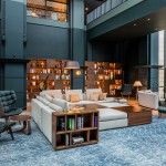
Blue symbolises trust and tranquillity, is often considered a calming colour, and goes well with grey and white to create a Scandinavian style. It’s reminiscent of flowing rivers, the ocean and the sky. The blue blossom of forget-me-nots help to stimulate mental clarity and creative expression, so floral arrangements also need to be considered from a design perspective. Perhaps the ideal choice for hotels by the sea or near water.
Oranges and reds symbolise energy, fire and passion, they resemble a sunset which represents creativity and emotion wellbeing. Mixing these colours with black would create a dramatic, mysterious ambience, perhaps lending themselves to Moroccan or Arabian interiors. However, where natural light is not in abundance, it may best to keep black to a minimum.
- Check out at some of the beautiful works of art we have created all over the world.
- Contact our team for more information on our custom contract design service or our online archive, Design Portal.
- You can find the full article on “The Psychology between Colour in Interior Design and Wellbeing” on the Hotel Designs website.

