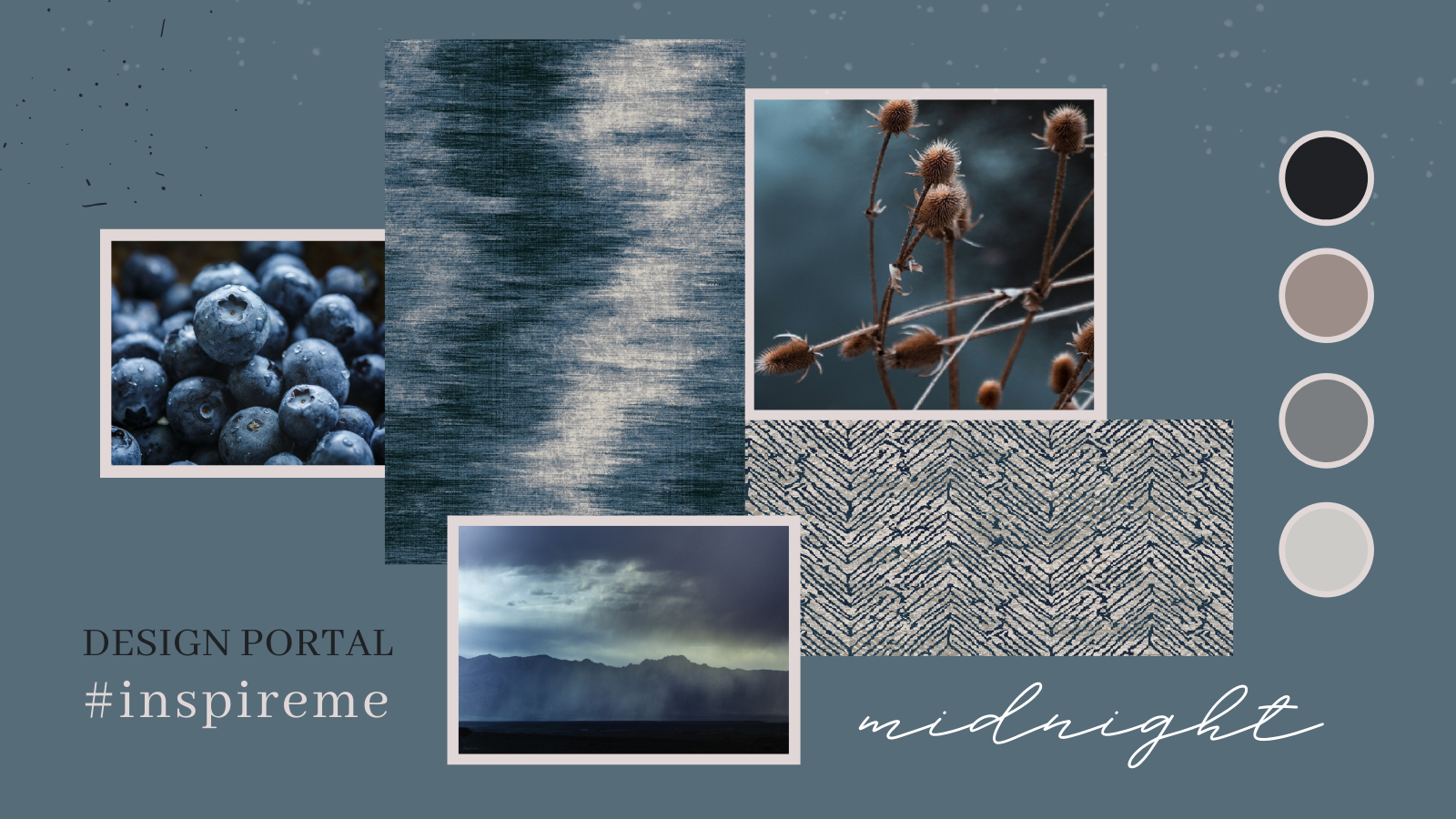
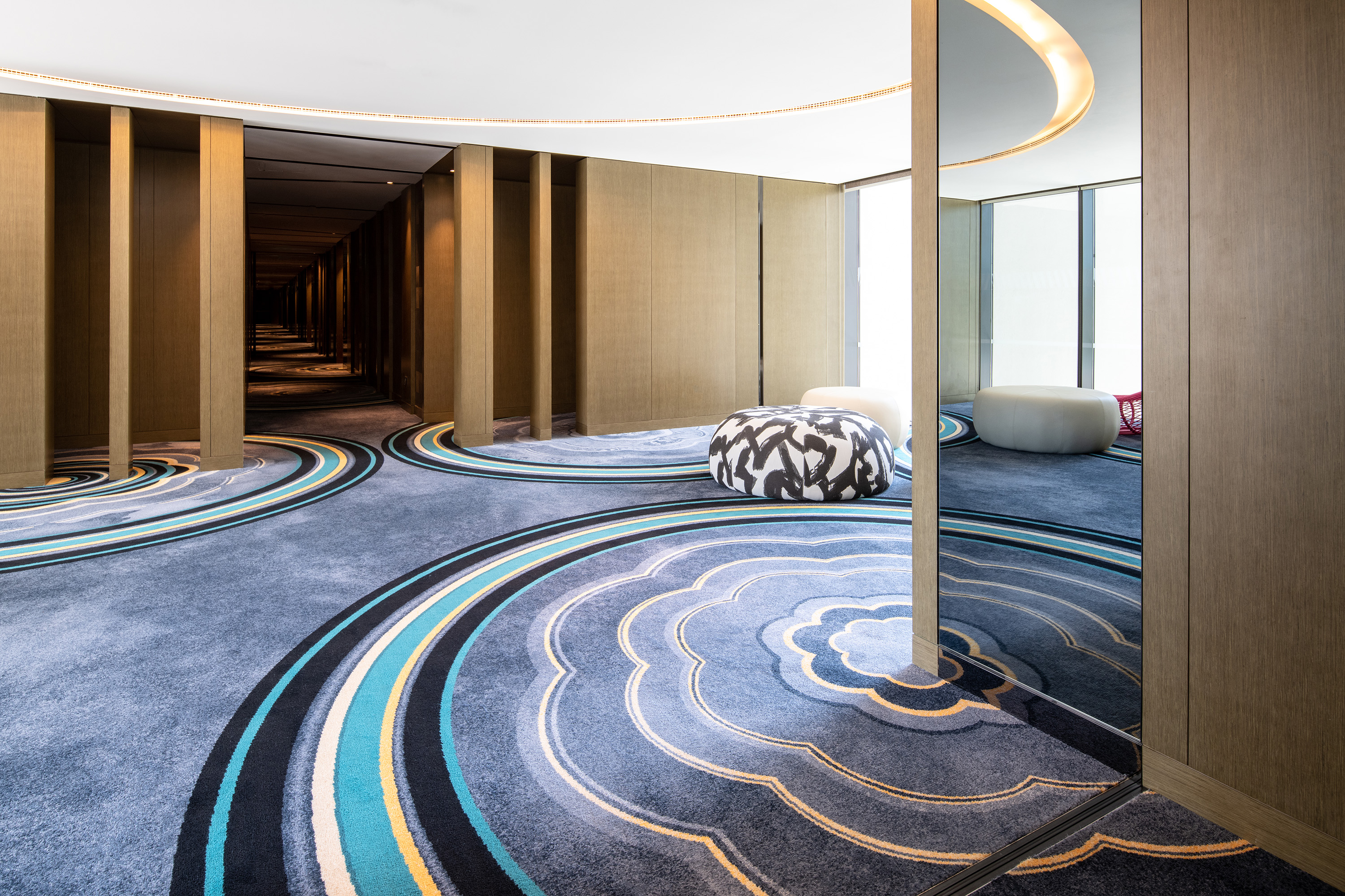
Influenced by the play of light and shadow at midnight, these eye-catching carpet designs are taken from our online gallery, Design Portal.
When you’re an interior designer, it can be easy to hit a brick wall when looking for inspiration. That is where Design Portal can make all the difference.
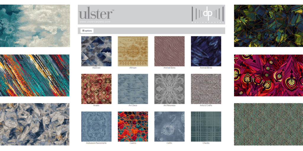
Packed full of over 9,000 designs, our online archive is easy to use and is a great way to get those creative juices flowing.
You can get a sense of what is currently on-trend by taking a look at some of the most recent designs from our creative teams based across the world.
If you want some ideas for organic designs, Japanese form or mineral styles, then you can browse our comprehensive Collections that have been expertly curated by our own Archivist.
Styles also have a habit of returning, so our Archive is also a great place to look. It contains thousands of different designs ranging from Abstract and Art Deco to Classical, Floral, Contemporary and many more.
Design Portal is also fully searchable using key words or by design numbers while you can also create your own favourites to keep for future reference.
In terms of designs and colours, Design Portal offers an abundance of choice and a plethora of inspiration, so why not make the most of it?
You have to be registered to enjoy the benefits of Design Portal – visit https://designportal.ulstercarpets.com to find out more.

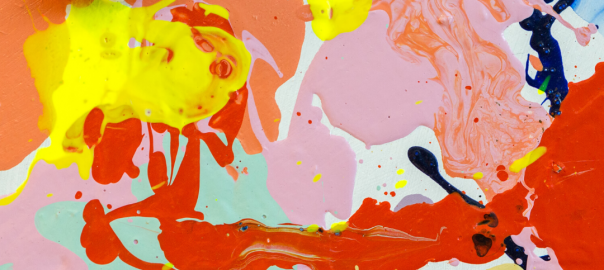
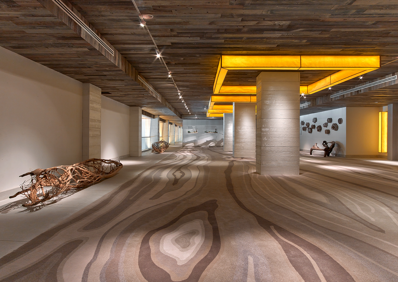
The Aqua Collection comprises of designs extracted from our online archive. This installment includes compositions inspired by nature.
Have you ever wondered why you feel so calm when entering into a beautiful room with blue accents or so refreshed in a green bioliphic inspired room?
It’s likely to be because of colour psychology in interior design, closely connecting colour to our emotions.
Colour selection plays such an important role for our design teams at Ulster. Therefore we want to share with you some secrets to colour selection and the psychology between colour in interior design and wellbeing.
Did you know colour has the power to raise or lower our heartbeat, affect our sleep and even influence our overall wellbeing? An incredible amount of research has been undertaken into the psychology of colour and the impact it has on our health. Let’s face it our wellbeing is more important now than ever – in all areas and aspects of our lives.
“Rooms should not be put together for show, but to nourish one’s own wellbeing.”
Albert Hadley, Interior Designer


Writing on behalf of Hotel Designs, brand strategist Emma Potter says, “Hotel interior design is deeper than simply decorating, colour schemes have the ability to cleverly transform and/or evoke emotions and designing with purpose as a whole will result in space that is more functional, more inviting and more appropriate to the guests checking in.”
Colour psychology is used as a powerful interior design tool that arguably has more of an impact on the mood of a room than any other factor. Emma Potter explains “Interior designers and hoteliers put a huge amount of effort into the hues they choose to decorate a space, be that a lobby, restaurant, bedroom or lounge area, as they appreciate the effect colour has on their consumers’ emotions. In order to create an appropriate scene for a certain target audience, it’s worth understanding the science of colour psychology and the tremendous ability it has to change entire moods.”
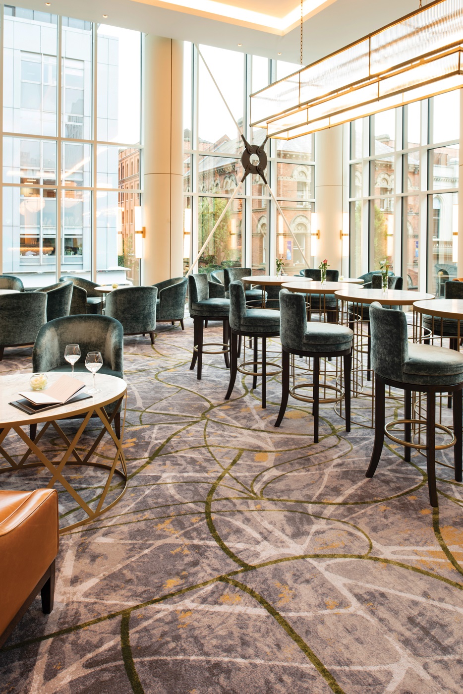
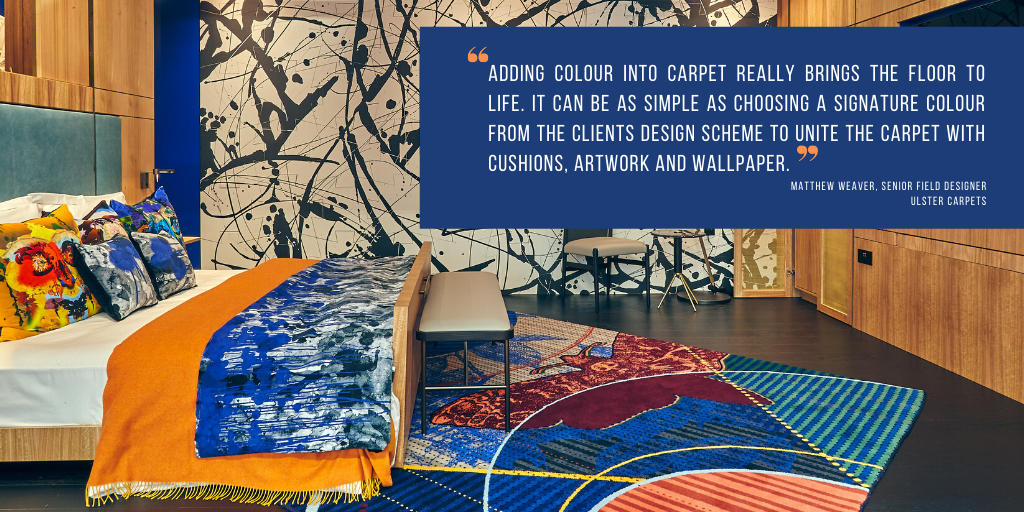
Thanks to Ulster’s unique advanced weaving technology we have total design freedom allowing our designers to maximise their colour usage to suit every brief. Matthew Weaver, a Senior Field Designer at Ulster, says “Adding colour into carpet really brings the floor to life. It can be as simple as choosing a signature colour from the clients design scheme to unite the carpet with cushions, artwork and wallpaper. Whether it’s a calming soft blue tone in a spa area alongside neutrals or a bold infusion of orange and teal in a restaurant, colour adds value and completes the story.”
Take a look at what Hotel Designs have put together:
Some may argue that using neutral colours (beige, cream, grey) will appeal to a broader market. While white may be a natural choice for a Greek Mediterranean style hotel, some people may associate white with cleanliness, whilst others may associate it with hospitals. Either way, white will significantly brighten up a room and will help to reflect light and colour.
Green typically symbolises growth and harmony, which is extremely grounding and brings us back to nature – think rolling countryside surrounded by lush leafy trees or blossoming flowers and open spaces. It is often associated with evoking a feeling of peace, trust and tranquillity, and it helps to reduce feelings of anxiety, whilst stimulating love, balance and harmony in the body. The ideal choice for rural hotels, some would argue. But it can also be injected into urban hotels to add flair, vibrancy and electricity.
Blue symbolises trust and tranquillity, is often considered a calming colour, and goes well with grey and white to create a Scandinavian style. It’s reminiscent of flowing rivers, the ocean and the sky. The blue blossom of forget-me-nots help to stimulate mental clarity and creative expression, so floral arrangements also need to be considered from a design perspective. Perhaps the ideal choice for hotels by the sea or near water.
Oranges and reds symbolise energy, fire and passion, they resemble a sunset which represents creativity and emotion wellbeing. Mixing these colours with black would create a dramatic, mysterious ambience, perhaps lending themselves to Moroccan or Arabian interiors. However, where natural light is not in abundance, it may best to keep black to a minimum.

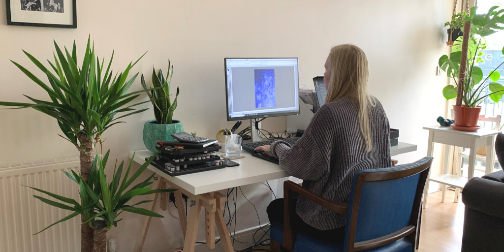
Hi! I’m Steph and I’m one of the Field Designers at Ulster, working on bespoke designs for the contract hospitality market. Last year I made the move over from London to Bristol, still working as part of the Ulster London team but swapping the Clerkenwell office to work remotely out of Danfloor’s HQ.
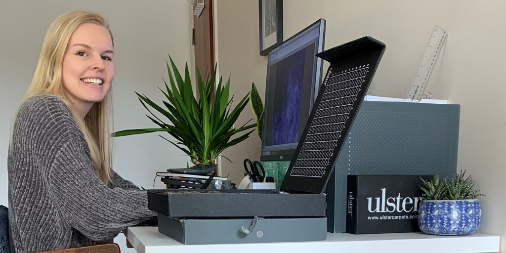
Like most people, I’m now working from home and can’t quite believe it’s the eighth week of doing so – it’s flown by! The first week was definitely the hardest, adjusting to the new ways of life. I was pretty restless being cooped up in the flat and not commuting in to the office. Thankfully since then I’ve got used to the new routine. My work desk is in the living room, but luckily there’s enough space that this is kept to a separate area and there’s room to spread out the hundreds of carpet tufts when assessing colours.
Before lockdown, I’d primarily work with designers over email and phone. The role of Field Designer also saw me travel all over the UK to meet clients, take initial design briefs and discuss ongoing projects face-to-face. This is definitely a social aspect of the job I’m missing and unfortunately we don’t know when this will be the norm again. It’s so important we all stay safe though and luckily this digital age allows us to work just as proficiently discussing briefs, feedback, design and colour over email and phone. Handtrials are still being despatched to customers from the factory which helps move the design progress along, as well as colour tufts still being sent out. These are particularly handy for designers also working from home, where Ulster reference boxes may be at their offices and therefore not accessible.
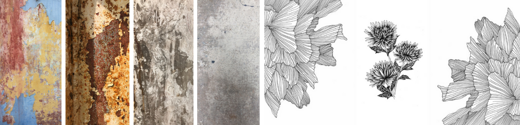
Working from home allows us to be just as creative as working from the office. Whether it’s painting brushstrokes, blotting ink, or drawing motifs from scratch, answering briefs and creating design work is done in the same way. Creating completely original source material is part of the design process I really enjoy. Textural details, however prominent or subtle, are usually an important part of designs and therefore surface textures have become a constant source of inspiration – I have a catalogue of photos of concrete, peeling rust, bark, woodwork etc to use within designs. Most of these were taken before lockdown and I’ve now been adding to this with textures I’ve found around the flat. We also have an incredible archive of designs to call upon online which is always inspiring to look through.
Experiencing remote-working has made the transition to working from home slightly easier. I still chat to my manager Anthony and other team members regularly as our London team is very close. My fellow Ulster designers are all extremely talented and I get to work on some of the most amazing design briefs set by our clients. These are the main reasons my working day is so enjoyable, wherever it is I’m working from.
We are here to do our part in keeping your projects on track so please don’t hesitate to contact your local sales representative if we can help in any way.
Above all stay safe and well,
Steph.
 To our clients worldwide
Firstly we hope and trust that you and your families are safe and well in what is a very uncertain time for us all.
We are all adapting to new ways of working and communicating with each other and remain committed to providing the support for your projects that you have come to expect from Ulster.
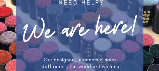
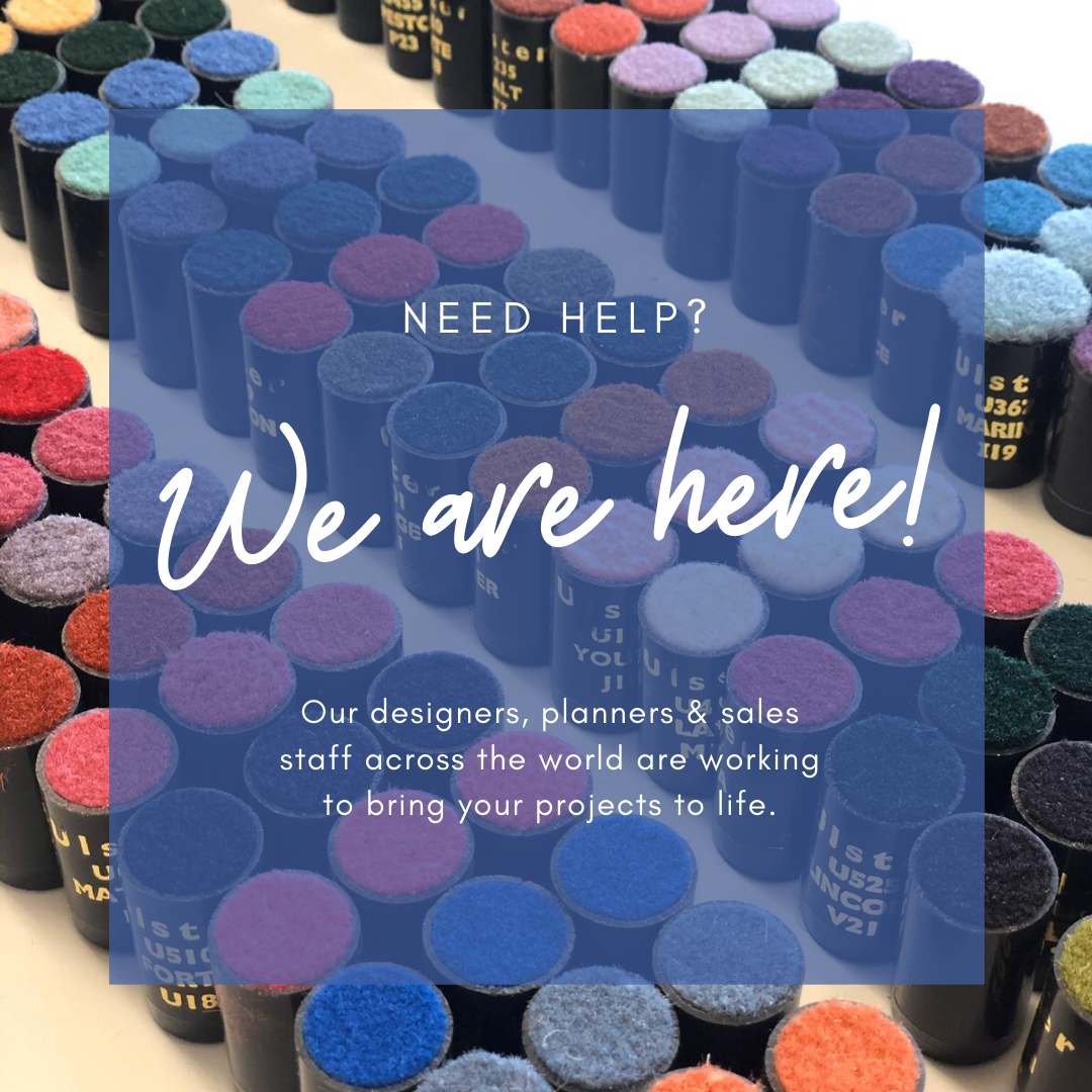
Our designers, planners & sales staff across the world are working actively from home to bring your projects to life. Design work, colour support, plans & commercial specifications are all available through our highly skilled teams.
Our online portal provides you with endless design inspirations, access to our wide range of colours and the opportunity to bring your creative ideas to the fore.
Handtrials and colour tufts are also available for despatch, on our fast 3 day turnaround, from our head office to assist you with your project development.
We are here to do our part in keeping your projects on track so please don’t hesitate to contact your local sales representative if we can help in any way.
Above all stay safe and well.
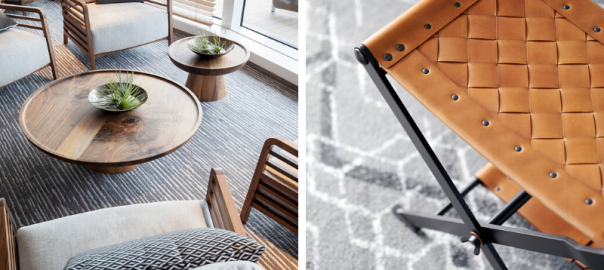
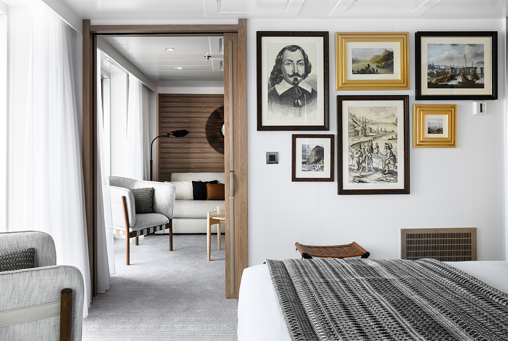
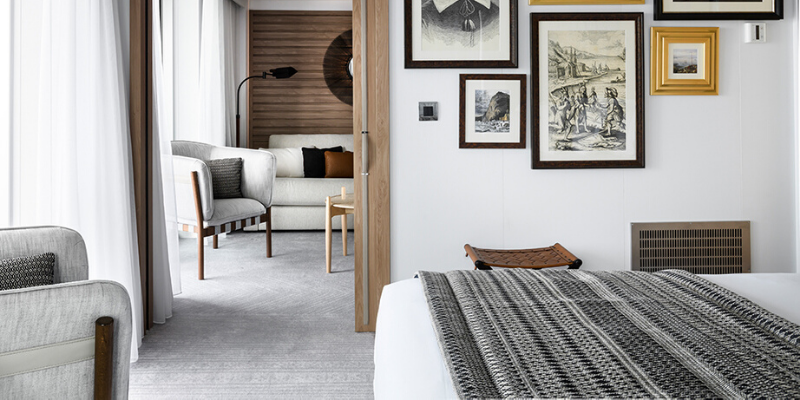
The latest issue of COVER – the magazine and website dedicated to carpets and textiles for modern interiors – features our work with Studio Philippe Nuel on the award-winning Ponant Le Champlain luxury yacht.
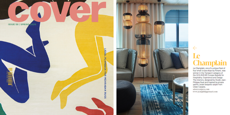
With a feature looking at how carpet and textiles are used for transport projects, the bespoke designs we created for this fleet of unique yachts proved a perfect example of how wool-rich carpets offer a sense of luxury, even within the unique demands of marine environments.
Winner of last year’s Transport Category at the AHEAD Europe Awards, Le Champlain is one of six luxury yachts from the Ponant fleet that feature our custom carpets.

Ponant are the market leaders in luxury expeditions to some of the most remote yet spectacular outposts in the world and Ulster worked with renowned architect and interior designer, Jean-Philippe Nuel of Studio Jean-Philippe Nuel, to add his signature style to these luxury yachts.
Our work on the Ponant fleet, as well as on some of world’s biggest cruise liners, perfectly reflects how we can combine the key attributes of design and durability that are essential to the hospitality sector.
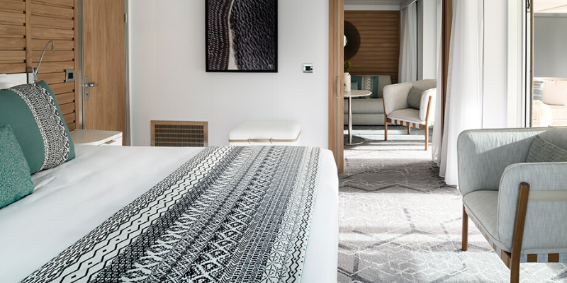
By using our own patented weaving method, the only limit to the designs we can create is your imagination. These unlimited design possibilities give interior designers the flexibility to incorporate additional colour, depth and texture to create flooring works of art.
This is enhanced by wool’s natural tendency to provide greater colour consistency, design clarity and definition. The natural elasticity of wool also means Ulster’s carpets resist compression and recover their shape much more readily while wool is also stain repellent and is easy to maintain with simple, regular maintenance.
All these factors are essential within hospitality environments and highlight why Ulster is chosen for some of the most prestigious hotels, casinos and cruise liners in the world.
To learn more about the design inspiration behind the Ponant project, read our Design Blog – https://ulstercarpets.com/blog/ponant-explorers/
To look at some of our work on projects across the world, visit https://ulstercarpets.com/contract/design/
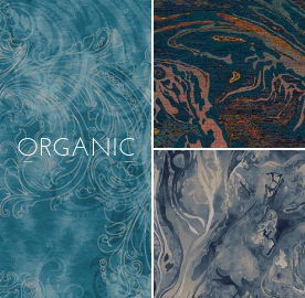
The Organic Collection comprises of designs extracted from our online archive. This installment includes compositions inspired by nature.